If your page looks ready and then jumps, that is CLS. Text moves. A button slides under your thumb. You click the wrong thing. It feels broken, even if load time is fast.
I have seen sites pass LCP and INP and still fail Core Web Vitals on CLS alone. That one metric is unforgiving. It does not care how fast you are if the layout moves after it looks stable.
This guide shows how to fix CLS properly in 2026. No hacks. No guessing. Just what causes shifts, four fixes that actually work, and how to apply them in WordPress with Bricks and WARP.
What a CLS of 0.1 Actually Measures
CLS stands for Cumulative Layout Shift. It measures how much visible content moves unexpectedly after it has rendered. Not load time. Movement.
Google scores it as a number. 0 is perfect. Anything at or below 0.1 is good. From 0.1 to 0.25 needs improvement. Above 0.25 is poor. That threshold has not changed, which is why a lot of 2026 advice still cites 0.1 as the target.
- CLS is cumulative. Small shifts add up across the entire page lifecycle.
- Only unexpected shifts count. Movement you trigger, like opening a menu, does not count if it happens within 500 ms of input.
- It is measured both in the lab and in the field. Field data from the Chrome UX Report (CrUX) is what matters for Core Web Vals. Lab data helps you reproduce issues.
Here is the mental model I use. The browser paints something. Then late content arrives or a size changes. The browser has to push existing content down or sideways. That push is a shift. If the content has already been visible, users notice.
Important detail: CLS counts shifts even after the initial load. A cookie banner that injects after 2 seconds. An ad that resizes. A web font that swaps and reflows text. All of that counts. This is why CLS can fail even on cached pages.
Why CLS Still Fails in 2026
The causes have not changed much in three years. We just have new ways to create them.
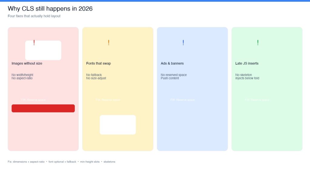
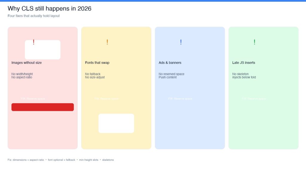
Most shifts come from four patterns. If you fix these, you fix almost every CLS issue I see on WordPress sites.
1. Images and media without dimensions
The classic. The browser does not know how tall an image will be until it loads. So it renders zero height, then the image arrives and everything below jumps. This happens with hero images, blog content images, and with responsive images that use srcset but lack width and height attributes.
With Bricks and page builders, this shows up when you drop an image and rely on CSS to size it, or when lazy loading defers the size calculation. Embeds do the same thing. YouTube iframes, Instagram embeds, and self-hosted video without aspect ratio wrappers all cause it.
2. Web fonts that cause reflow
Custom fonts make text flash or swap. If the fallback font and the web font have different metrics, line breaks change. Paragraphs get taller or shorter. Headings wrap differently. Everything shifts.
The default browser behavior with font-display: swap guarantees a swap. That swap can be invisible on your fast connection and obvious on a visitor’s slower one. Google Fonts loading without a fallback stack makes it worse.
3. Ads, cookie banners, and announcement bars
Anything that injects at the top or middle of the page after render will push content. Cookie consent banners are the most common offender in the EU. They often load late via JavaScript, slide in, and shove the header down.
Ads are similar. If the ad slot has no fixed size, it collapses to zero height, then expands when the creative loads. Different creatives have different heights. On one pageview it is 250 tall, on the next it is 90. That inconsistency creates cumulative shifts.
4. Late widgets and JavaScript inserts
This is the sneaky one. Related posts injected via JS. Newsletter popups. Chat widgets. Social embeds that hydrate late. Review widgets. A/B test variations.
These often load after user interaction or after a delay, so you will not catch them in a quick Lighthouse run. But CrUX catches them. Field data sees what lab tests miss. That is why a site can score 0 CLS in Lighthouse and 0.18 in the field.
Fix 1: Give Every Image and Embed Explicit Dimensions
This is the highest impact fix. And it is simple.
The browser needs to reserve space before the file loads. You do that with width and height attributes or with CSS aspect-ratio.
The HTML way
Always include width and height on images. Modern browsers use those attributes to calculate aspect ratio even when CSS makes the image responsive.
<!-- Good: browser can reserve space immediately -->
<img src="hero-1200.webp" width="1200" height="675" alt="Team working on laptops" loading="eager" fetchpriority="high">

<!-- Bad: no dimensions, layout will shift -->
<img src="hero-1200.webp" alt="Team working on laptops">
The CSS way with aspect-ratio
Use aspect-ratio for responsive containers, especially for embeds and hero sections. This is essential for 16:9 videos and for images scaled with CSS.
/* Reserve space for responsive images */
img {
  width: 100%;
  height: auto;
  aspect-ratio: attr(width) / attr(height);
}

/* Explicit aspect ratio for embeds */
.video-wrapper {
  aspect-ratio: 16 / 9;
  width: 100%;
  background: #f1f5f9; /* placeholder color while loading */
}

.video-wrapper iframe {
  width: 100%;
  height: 100%;
  border: 0;
}
That background color is not decoration. It gives users visual feedback that space is reserved, and it avoids a flash of white before the video loads.
WordPress and Bricks specifics
- In Bricks Builder, check Image elements. Bricks usually outputs width and height, but if you use an external URL or dynamic image, verify the attributes are present in the rendered HTML.
- For featured images and post content, WordPress adds width and height automatically since 5.5. If your theme or plugin strips them, put them back.
- For background images with
background-image, there is no intrinsic size. Wrap the section in a container withaspect-ratioormin-heightso the section does not collapse before the image paints. - Set
fetchpriority="high"andloading="eager"for the LCP hero image. Lazy load everything else. Lazy loading the hero actually increases CLS risk because its dimensions resolve later.
Test this fix with DevTools. Disable cache, throttle to Fast 3G, and reload. Watch for jumps. If an image causes a jump, it needs dimensions.
Fix 2: Stop Font Swaps From Moving Text
Fonts are the second most common CLS cause after images. The fix is about fallback, not just speed.
You want one of two outcomes: either the fallback stays until the web font is ready and matches closely enough that no reflow happens, or you avoid the swap entirely on slow connections.
Use font-display: optional for most body text
font-display: optional tells the browser to use the web font only if it is already cached or loads extremely quickly. If not, stick with the fallback for this pageview. Next time, if the font is cached, it will be used. Almost no layout shift.
This is a tradeoff. You may not show the brand font on the first visit for slow users. In my experience, that is better than shifting the layout on every first visit.
/* Prefer optional to avoid layout reflow */
@font-face {
  font-family: 'Inter';
  src: url('/fonts/inter-v12-latin-regular.woff2') format('woff2');
  font-weight: 400;
  font-style: normal;
  font-display: optional;
  ascent-override: 90%;
  descent-override: 22%;
  line-gap-override: 0%;
  size-adjust: 100%;
}
The overrides matter. ascent-override, descent-override, and size-adjust let you tune the fallback so it matches the web font’s metrics. Without them, even optional can shift when the font does swap on a fast connection.
Match your fallback stack
/* Good: system fallback that matches metrics */
body {
  font-family: 'Inter', system-ui, -apple-system, 'Segoe UI', Roboto, Helvetica, Arial, sans-serif;
  font-synthesis: none;
}

/* Preload only the critical font files */
<link rel="preload" href="/fonts/inter-v12-latin-regular.woff2" as="font" type="font/woff2" crossorigin>
<link rel="preload" href="/fonts/inter-v12-latin-600.woff2" as="font" type="font/woff2" crossorigin>- Preload at most two font files. Usually Regular and Bold or SemiBold. Preloading five files hurts performance more than it helps.
- Self host fonts when you can. Google Fonts adds an extra connection and often loads without overrides. Tools like google-webfonts-helper give you the woff2 files and CSS with the right settings.
- If you must use
font-display: swap, keep it only for headings where a short invisible period is acceptable, and still add fallback overrides.
How to check
In Chrome DevTools, go to Rendering and enable Layout Shift Regions. Reload. Areas that shift will flash blue. Then check the Performance panel. Look for shifts marked with Layout Shift and see the culprit node. If it is a text node that changed size after a font loaded, you have a font CLS issue.
Fix 3: Reserve Space for Ads, Banners, and Sticky Bars
Anything that loads from a third party needs a placeholder. Without it, you are guessing at height.
This is the rule: if it injects after render, it must have a reserved box.
Cookie banners and announcement bars
The cleanest approach is to allocate space in CSS before the banner JS runs. Do not let the banner push content. Overlay it or reserve its slot.
<!-- Reserve space in layout before consent JS loads -->
<div id="consent-placeholder" style="min-height: 0;"></div>
<div id="cookie-banner" class="cookie-banner" hidden>
  <p>We use cookies to improve your experience. <a href="/privacy/">Learn more</a></p>
  <button type="button" id="accept-cookies">Accept</button>
</div>

<style>
/* Option 1: Overlay at bottom, no push */
.cookie-banner {
  position: fixed;
  bottom: 0;
  left: 0;
  right: 0;
  z-index: 999;
  padding: 16px 24px;
  background: #0f172a;
  color: #fff;
  min-height: 64px;
}

/* Option 2: Reserved slot at top (choose one approach) */
.has-consent-bar #consent-placeholder {
  min-height: 64px;
}
</style>
Pick one. Fixed overlay is usually better for CLS because it never shifts content. Reserved slot works if you want the banner in flow, but you must set the min-height to match the real banner height on mobile and desktop. A 64 pixel placeholder that becomes 96 pixels on mobile will still shift.
Ads
For ads, reserve the largest likely size. Yes, you will have some whitespace when a smaller creative serves. That whitespace is intentional. It prevents shifts.
<!-- Ad slot with reserved space -->
<div class="ad-slot" style="min-height: 250px; min-width: 300px; background: #f8fafc; display: flex; align-items: center; justify-content: center;">
  <div id="ad-top-leaderboard"></div>
</div>

<style>
.ad-slot {
  /* Collapse gracefully if no ad fills */
  contain: layout;
}

/* Responsive reservation */
@media (max-width: 768px) {
  .ad-slot {
    min-height: 100px;
  }
}
</style>- If you use AdSense or similar, set the slot size in the ad code and match it in CSS. Do not use auto-sized responsive ads without a wrapper that enforces a minimum.
- For sticky headers that shrink on scroll, reserve the full header height with a wrapper so content does not jump when the header changes size.
- Test with an empty ad response. What happens when no ad loads matters as much as when one does.
Fix 4: Handle Late JavaScript Inserts Without Shifting
This is where most WordPress sites lose the CLS battle in the field. Your lab test looks clean. Real users still get shifts from widgets that load late.
The principle is simple. Any element added to the DOM after the initial render should either be absolutely positioned, or it should insert into a box that already exists.
Common offenders and what to do
- Related posts and injected content: Render a placeholder div in the initial HTML where the widget will go. Give it a min-height that matches the loaded widget. Let JS fill the box, not create it.
- Embeds and social widgets: Do not inject Twitter, Instagram, or TikTok embeds without a wrapper that reserves height. Those embeds often render at zero height then expand.
- Live chat and popups: Load them as fixed overlays anchored to the viewport. They should never push page content.
- A/B testing tools: Hide the variant container with a placeholder until the test decides. Flicker that moves layout counts as CLS.
// Bad: appends element and pushes content down
fetch('/api/related-posts')
  .then(r => r.json())
  .then(posts => {
    const el = document.createElement('div');
    el.innerHTML = renderPosts(posts);
    document.querySelector('#content').appendChild(el);
  });

// Better: fills reserved slot, no shift
fetch('/api/related-posts')
  .then(r => r.json())
  .then(posts => {
    const slot = document.querySelector('#related-posts-slot');
    if (slot) slot.innerHTML = renderPosts(posts);
  });
<!-- In your template: reserve before JS runs -->
<section id="related-posts-slot" style="min-height: 420px; contain: layout;" aria-live="polite">
<!-- Skeleton while loading, keeps height stable -->
<div class="skeleton-grid" aria-hidden="true">
<div class="skeleton-card"></div>
<div class="skeleton-card"></div>
<div class="skeleton-card"></div>
</div>
</section>The skeleton is optional but useful. It tells users something is coming and it keeps the height predictable. Without it, you still need the min-height.
Order matters
Load late inserts after the main content is stable, but do not delay them so long that they surprise users who have already started reading. For most sites, a good order is: critical content, then related posts placeholder fill, then non critical widgets like chat. And always use content-visibility: auto or contain: layout on large sections to limit the scope of any reflow when it does happen.
Bricks and WARP: Where to Apply These Fixes
The fixes above are universal. Here is how they map to a typical Bricks plus WARP stack at warpperformance.com. For the broader stack, see our WordPress performance guide (2026).
In Bricks Builder
- Images: Use the Image element, not a plain HTML image without dimensions. In the element settings, keep the image size set to a registered size. If you use Dynamic Data for an ACF image field, make sure the field returns an image array or ID so Bricks can output width and height. Check rendered HTML, not just the builder preview. Details in WARP docs.
- Videos and iframes: Use the Video element with aspect ratio set, or wrap custom iframes in a Div with
aspect-ratio: 16/9in the Custom CSS control. - Fonts: Under Bricks > Settings > Custom Code or your child theme, self host fonts and add
font-display: optionalwith overrides. If you use Google Fonts via Bricks settings, consider switching to locally hosted woff2 to control loading behavior. - Header and banners: If you have a sticky header, set a wrapper with explicit height. For announcement bars built in Bricks Templates, create a fixed position template or a header section with min-height so enabling the template does not push the layout.
In WARP Performance
WARP helps with CLS indirectly, but it matters.
- Font optimization: WARP Performance can preload critical fonts and add
font-displayhandling. Use it to preload only your primary woff2 files and to ensure fallback CSS is loaded early. - Script delay and defer: Be careful here. Delaying non-critical JavaScript can reduce main thread blocking, which helps INP, but delaying a script that reserves space or positions a banner can make CLS worse if that space depends on JS running early. Exclude consent, ad setup, and layout reservation scripts from delay.
- Lazy loading: WARP’s lazy loading should exclude above the fold images. Lazy loading the LCP image is a common mistake that increases CLS because the hero’s height resolves later.
- Critical CSS: If you use Critical CSS, verify that rules for aspect-ratio wrappers and header height are inlined. If Critical CSS misses them, the placeholder arrives late and shifts occur.
I recommend this test whenever you enable optimizations. Throttle, reload, and watch for shifts with Layout Shift Regions enabled. Then run a field check after a week. Lab and field should converge if the fix is solid.
Illustrative Pattern: How a Typical WordPress Blog Fixes CLS
Not a case study. Just a pattern I see often, so you can map it to your own site.
A WordPress blog runs Bricks, a cookie banner plugin, Google Fonts, and a related posts widget loaded via JavaScript. Field CLS is 0.16 at the 75th percentile. Lighthouse lab CLS is 0.02. The gap is the clue. Lab misses what field users hit.
The audit finds three issues. Featured images in archive grids have no width or height because the loop uses a custom query with external image URLs. The cookie banner injects at the top without reserved space. The related posts widget appends below the article after 1.2 seconds.
Fixes in order: first, add width and height to archive images and add aspect-ratio: 4/3 wrapper so grid cards keep a stable height. Second, move the cookie banner to fixed overlay instead of pushing content. Third, self host fonts with optional and fallback overrides. Fourth, render a reserved div for related posts with a 420 pixel min-height skeleton.
After deployment, lab CLS stays near zero. That is expected. The meaningful signal is field CLS at the 75th percentile dropping below 0.1 over the next 28 days as CrUX updates. That is how you know it worked. Not the next day. After real users have built a new data window.
You will not get that timeline from a single PageSpeed test. You need Search Console or a RUM tool that reports the same 75th percentile methodology.
Checklist: Fix CLS Before You Ship
- Every image has width and height attributes. Responsive via CSS with height auto.
- Every iframe and video has an aspect-ratio wrapper or explicit dimensions.
- Hero and LCP image is eager loaded with fetchpriority high, not lazy loaded.
- Fonts use font-display optional with fallback overrides, or swap plus overrides with only two files preloaded.
- Cookie banner and announcement bars are fixed overlays or have reserved min-height matching actual height on mobile and desktop.
- Ad slots have wrapper with min-height for the largest creative. No auto collapse.
- Sticky headers have a wrapper that reserves full height.
- Related posts, embeds, and widgets fill reserved slots. They do not append and push.
- Chat, popups, and banners use position fixed. Never in flow after load.
- Layout reservation CSS is inlined or in Critical CSS, not loaded late.
- WARP exclusions set for consent, ads, and layout scripts. Hero excluded from lazy load.
- Tested with throttling, Layout Shift Regions, and Performance panel. Verified after 28 days in CrUX.
FAQ: Fixing CLS in 2026
What is a good CLS score in 2026?
Good is 0.1 or below at the 75th percentile of field data. That is the Core Web Vitals threshold Google uses. Needs improvement is 0.1 to 0.25. Poor is above 0.25. A single lab test showing 0 does not mean your field data passes. Check Search Console or CrUX for the field number.
Why does PageSpeed show good CLS but Search Console shows poor?
PageSpeed Insights shows both lab and field data, but lab runs in a clean state without real user conditions. Field data includes things lab often misses: cookie banners that load only in certain regions, ads with varying heights, related posts that load late, and users on slower devices. If field is worse, look for late inserts and third party content without reserved space.
Does lazy loading hurt CLS?
It can, but only when done wrong. Lazy loading below the fold images is fine and recommended. Lazy loading the hero or LCP image hurts because its dimensions resolve later and can shift content. Keep above the fold images eager. Make sure every lazy loaded image still has width, height, and height auto so space is reserved even before it loads.
Should I use font-display swap or optional?
Use optional for body text if CLS is your priority. It prevents swaps on slow connections and avoids most reflow. Use swap only when you need the web font to appear on every view regardless of speed, and pair it with fallback size overrides so the reflow is minimal. In either case, self host and preload only the critical weights. Avoid loading five font files.
Can a WordPress plugin fix CLS automatically?
Plugins can help with parts of it. WARP and similar tools can handle font preloading, lazy load exclusions, and Critical CSS. But no plugin can know how tall your cookie banner or ad creative will be. You still need to reserve space in your templates and Bricks layouts. CLS is a layout problem. Automation helps, manual layout decisions finish it.
Sources
- web.dev: Cumulative Layout Shift (CLS) – definition, how CLS is calculated, and why unexpected movement matters
- web.dev: Optimize Cumulative Layout Shift – guidance on images, ads, embeds, fonts, and avoiding late content injection
- MDN Web Docs: CSS aspect-ratio and @font-face font-display – reference for aspect-ratio reservations and font-display values including optional and swap, plus fallback overrides
- Chrome for Developers: Chrome UX Report (CrUX) – field data methodology, 75th percentile, and how Core Web Vitals are aggregated from real user visits
Fix CLS by giving the browser what it needs early. Need the toggle? WARP Performance handles font preload and script exclusions in one place — 14-day trial. Space for media, stable fonts, and boxes for anything that loads late. Do that, and your layout stops surprising people.
Next in the CLS series: diagnosing CLS with DevTools and CrUX, so you can find the exact shift before you fix it.